Wednesday, 29 June 2011
My colleague's Blog [Gasak: We Run This!]
Gasak: We Run This!: "Studio Photography. Graffiti Theme. Calyn Hilder Calyn Hilder Calyn Hilder Calyn Hilder David McClenahan "
Friday, 24 June 2011
The charm bracelet
Good morning my friends and Blog readers. I've enjoyed taking some new photographs.

Its been a while since I updated my blog, and I thought of starting with something I love: charm bracelets. As a photographer/ designer/ animator I'm intrigued on the amount of detail that goes into the charms. The heart charm on this particular bracelet reminds me of Kat von D's tattoo art. Check out her website.

The contrast in this image is in my opinion great, her hand was in the sun and most of her charms are in a nice dark shade. The thing I love the most about being here in Durban is the beach, sun, and my friends and classes. Photography has become a new found skill to me, when this year started I fell in love with black and white photography. I enjoy this, and will upload some more photographs soon.

Thank you Anisah, I enjoyed our photo shoot. College has closed today which means this was possibly my last photo shoot at college this semester. I shall post more Blog updates during my 3 week holiday on design. Animation. Photography, and stuff.
From me, I hope you have an amazing day! Until my next post, take care guys. Don't forget to check out Kat von D's amazing tattoo gallery at www.katvond.net I love her style.

Its been a while since I updated my blog, and I thought of starting with something I love: charm bracelets. As a photographer/ designer/ animator I'm intrigued on the amount of detail that goes into the charms. The heart charm on this particular bracelet reminds me of Kat von D's tattoo art. Check out her website.

The contrast in this image is in my opinion great, her hand was in the sun and most of her charms are in a nice dark shade. The thing I love the most about being here in Durban is the beach, sun, and my friends and classes. Photography has become a new found skill to me, when this year started I fell in love with black and white photography. I enjoy this, and will upload some more photographs soon.
Thank you Anisah, I enjoyed our photo shoot. College has closed today which means this was possibly my last photo shoot at college this semester. I shall post more Blog updates during my 3 week holiday on design. Animation. Photography, and stuff.
From me, I hope you have an amazing day! Until my next post, take care guys. Don't forget to check out Kat von D's amazing tattoo gallery at www.katvond.net I love her style.
Friday, 17 June 2011
Kingdom Of New Rags...: NOT JUST A PRETTY FACE!
Kingdom Of New Rags...: NOT JUST A PRETTY FACE!: "A sepctacular exhibition by a little girl made a big splash in the New York art world this week. This four year old Aelita Andre of Australi..."
Kingdom Of New Rags...: Fashion In Their Own Right.
Kingdom Of New Rags...: Fashion In Their Own Right.: "Pam 22, Dental tech Mastors student at DUT. Sthe 21, Student at Howard College. Ayanda 21, Finace student at Oval Internationa..."
Monday, 13 June 2011
Ninjess (Character design)

I really enjoyed designing this Ninja character, and thought it would be nice to just share it. I made her in Illustrator using the pen tool. I particulary like the eyes of this character, partially hidden with a dark eye shadow. I've been watching too much "Soul Eater". Its an amazing show, I generally never really liked Anime until recently and in my opinion soul Eater is one of my top favourites (so far).
I animate using Toon Boom Studio for those of you who didn't know already, and recently started exploring Illustrator. I hope to keep improving my shading and drawing techniques. For now this is all I had to share, feel free to watch some of my animations on my website http://www.totally2d.org/. As of now Ninjess shall just remain a random character design, my hands shall be tied as I attempt to continue tuckling my pending animation projects namely HOOKED ALIVE and a 2 minute poem by an amazing artist called Elsa. I'm really enjoying changing gears between photography, design and animation! I have so much to learn in all those fields, and won't stop until I become the best I can be in all those fields.
Here are some of the Blogs by some of my friends, check them out:
http://amanchotani.blogspot.com/
http://ackiekingdomrags.blogspot.com/
http://homebreweddesign.blogspot.com/
Enjoy those Blogs, I know I do.
Tafadzwa
Tafadzwa
Friday, 10 June 2011
Pull yourself together...

The end result of my Font assignment, "Pull yourself together". I designed it some time ago and wish I could just stick it up on my wall so that when I wake up or start having a terrible day I can read it and Pull myself together. I think the robot seems to work really well with the statement. Anyway... enjoy your day and .... hey, if things to go smoothly just pull yourself together, and be HAPPY! Thanks for visiting this blog, I shall be posting another update soon. Those who haven't seen my website should feel free to visit http://www.totally2d.org/
Cheers! - Tafadzwa
Thursday, 9 June 2011
Yap.. We Can


Nobody told me how hard it is to photograph children, you just can't keep them still. They're kids. It takes a lot of patience to get the snap you wanted, I had originally wanted to photograph my 'model' above on a swing. However she didn't FEEL LIKE IT. :D kids 'ey what can you do? The amazing thing about photographing kids is that you must keep your camera on, and be ALERT for unexpected yet beautiful moments.

I put in the caption "Yes we can" because of how we always assume children cant do certain things and if we give them the chance they might prove us wrong. Yes she can put on her own shoes!

Another "Yes we can" shot above. Yap we can... put on our own shoes if you let us once in a while. How else can we learn these things?


I shall soon be bouncing back to my first passion, Animation! I really enjoy the insight that I've got in learning photography and hope it shall come in handy when I resume my animation project(s). Thanks for visiting my Blog, I hope you enjoyed it as much as I enjoyed updating it. Take care!
Monday, 6 June 2011
Creating a Typeface.

In this assignment my job was simple, I had to create a font that I was later told would be used by me in a poster. This involved a lot of construction lines and patience. A up to Z, lower and upper case!


If you look at the two photographs above you'll realise that a lot of calculating, and measuring went into creating proportional letters that can be used together. All in all, this was a great project for me.
All the best
Tafadzwa Tarumbwa
www.totally2d.org
Random Sketching [part 2]
I enjoy working in ink, all these designs were done in ink and because of that there is no room for mistakes. Thats why all the characters tend to have their construction lines on them. It gives them a certain... feel.

Most of the characters I sketched in this pad are human, which is strange since i usually used to do creatures and fantasy beings. In the scan below you can see a octa-muntant creature. Thats more of the art I miss doing, I'll be going down that road soon.

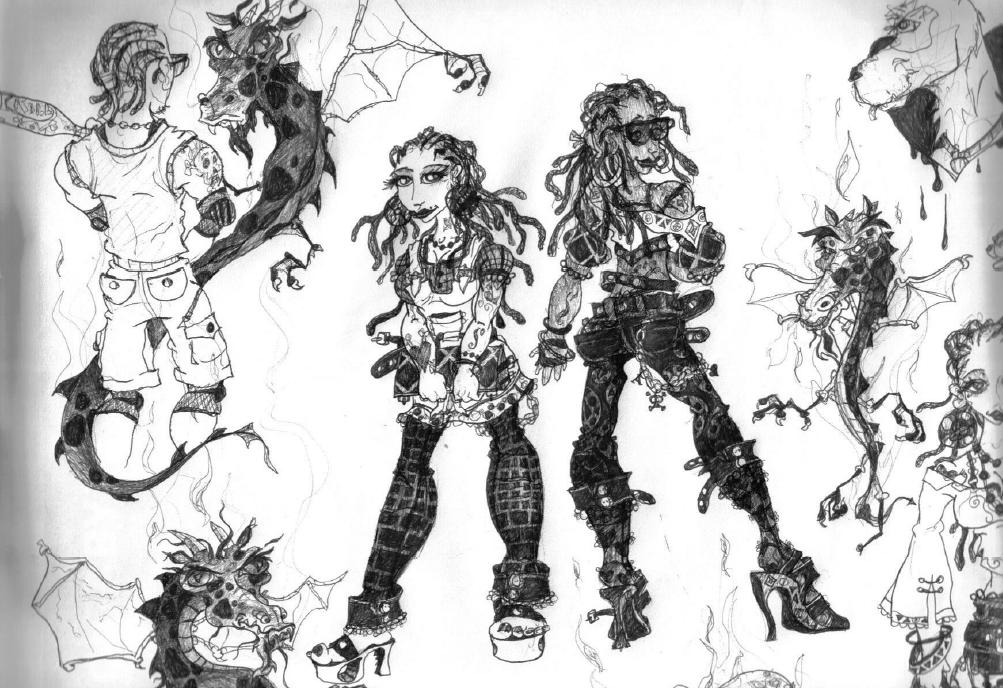
That it for now, I'll upload more works from this collection sometime this week. Enjoy your day, and thanks for coming back to my blog. You can also check out my website www.totally2d.org (I haven't updated it in a while but I'm working on it). Cheers!
Random Sketching [part 1]


The above piece was really challenging for me to draw, I kept thinking "what if I make a mistake, is this hand/ leg long enough. Did I twist her too much." When you're drawing/ designing anything that's the last thing you need going on in your mind. I don't usually quote on this blog but Shakespear once said, “Our doubts are traitors and make us lose the good we oft might win, by fearing to attempt”

So.... its a Saturday, I have a lot of art and design waiting to be done! I love that, and these are just random character designs I drew last year and loved to share them with you all. the middle one is one of my favorites in this sketch pad I scanned. Looking back at these inspires me to want to come up with better and better character designs.
Enjoy your day!
Friday, 3 June 2011
2 point Perspective, BURST of colours and..... a shoe

The above piece is a 2 point perspective illustration I worked on sometime ago. I loved working on this (as with all my other work) especially the construction lines that are all around the arms and body. If you look at her right arm you can even see that I thought of giving her long sleeves. I'm not really a big fan of hiding my character's arms but sleeves would have helped in giving the free-falling (wind) effect. I then realized that, hey! I can just use a bangle to enhance the pictures free falling feel. Lastly I think not erasing the construction lines seem to do wonders in "creating a feel" for this piece.

Burst of colour. In the above piece I stepped out of my comfort zone and..... used markers, again. If you look closely though you can see a bit of coloured pencil-work in it. Symbiosis? I wanted to portray how connected Zimbabwe and South Africa (in fact..... the WHOLE of Africa) We are somewhat, connected. One can also not how yellow (wealth/Gold), green (Vegetation/ natural resources), and red [blood shed during independence war(s)] are colours we all have in most if not all African flags Zim and S.A included.
Speaking of markers and fine liners, I also used them to draw my shoe below.

Well..... I think thats everything for now, Thank you for reading my post today. Enjoy your Weekend.
All the best
Tafadzwa Tarumbwa
Wednesday, 1 June 2011
Zama - licious
In order to improve on my photography skills I shall be practising in random shoots with some of my model friends. Zama did a great job in understanding the emotion I wanted. Thanks love, these are some great head shots.I shall also do another shoot soon with Tash from my "Addicted to Jeans" photo-shoot I posted earlier in this blog.


Come to me... Took this one so that I can play around with the 'depth of field'. Which allows me to blur the hand and focus on the gorgeous Zama.

In the above photograph I just wanted to highlight how I personally don't like ugly horizontal lines on my photos. I prefer to slant my buildings/ furniture at an angle. The only time i would allow some straight/ horizontal subject can work for me is when I'm working on some cooperate work. It all just depends on what project you're working on.


After I had all the photos I wanted I took the one above after asking Zama to give me a random pose. I really enjoyed working on these pics with her.


The above picture was one of my first attempts at HDR photography. I took 5 pictures and layered them one on top of other in photoshop. I ended up using only 3 of the images to compose the hdr fill you can see on the right of the above picture. What I love about hdr is the way detail is enhanced in this case you can see how detailed the tree's reflection is on the rear window. I wish I had a better sky to work with to have more defined cloud detail. I shall keep working on my hdr skills, and those who want to learn about how to achieve hdr photography can visit http://www.stuckincustoms.com/hdr-photoshop/
For some inspiration on how amazing HDR photography is visit www.davehillphoto.com/

Beautiful

Come to me... Took this one so that I can play around with the 'depth of field'. Which allows me to blur the hand and focus on the gorgeous Zama.

In the above photograph I just wanted to highlight how I personally don't like ugly horizontal lines on my photos. I prefer to slant my buildings/ furniture at an angle. The only time i would allow some straight/ horizontal subject can work for me is when I'm working on some cooperate work. It all just depends on what project you're working on.


After I had all the photos I wanted I took the one above after asking Zama to give me a random pose. I really enjoyed working on these pics with her.

Thanks Zama, these are some great head shots.

The above picture was one of my first attempts at HDR photography. I took 5 pictures and layered them one on top of other in photoshop. I ended up using only 3 of the images to compose the hdr fill you can see on the right of the above picture. What I love about hdr is the way detail is enhanced in this case you can see how detailed the tree's reflection is on the rear window. I wish I had a better sky to work with to have more defined cloud detail. I shall keep working on my hdr skills, and those who want to learn about how to achieve hdr photography can visit http://www.stuckincustoms.com/hdr-photoshop/
For some inspiration on how amazing HDR photography is visit www.davehillphoto.com/
Subscribe to:
Posts (Atom)